



I see too many web stores with a poor mobile experience. It’s not neglect. It’s because the people running the store only look at it on a desktop.
Open your site on mobile in an incognito window, and see what happens. You’ll replicate the experience of a visitor from a Reel, a TikTok, or an influencer story. She likely arrives unaware of your business with no saved login, no cookies, and no cart history.
A returning shopper will push through friction, but cold social visitors will typically revert to the app they came from.
Here’s what to look for.

Too many web stores have a poor mobile experience.
Mobile Friction
‘Yay! Another pop-up!’
Said no one ever. Shoppers enter an ecommerce site curious, if not eager, to see the products. But then there’s the mandatory cookie consent pop-up. A frictionless one requires a single click. A deal-breaker forces the visitor to toggle repeatedly just to maintain privacy.
Next could be an age check or country selector. And then there’s the ubiquitous fill-in-your-email pop-up.
And that’s for a visitor who wanted to view a shirt.
The fix? Start by configuring the email pop-up to appear after a pause. A/B test the timing, perhaps after the visitor has scrolled down the landing page or even on the second page.
Nice on Figma
A store’s design in Figma is a full-height, edge-to-edge canvas without the mobile address bar, home icon, or an iPhone Dynamic Island, the area at the top of the screen for alerts or a camera icon.
Anything pinned to the top or bottom of the Figma design can end up partly covered (or worse) on a phone.
Test all combined desktop elements on a phone. Each component may pass a UX review on its own, but not stacked together. A sticky header and add-to-cart bar can leave surprisingly little room for the product itself. Measure on a few real phones how much screen is left.
The fonts are too small
Too many product pages are now built for AI agents, not humans. The result is frequently tiny text and data overload. Light gray serif fonts make it worse.
Merchants can do both: serve the folks who buy the products and convey details to genAI platforms. Prioritize the former.
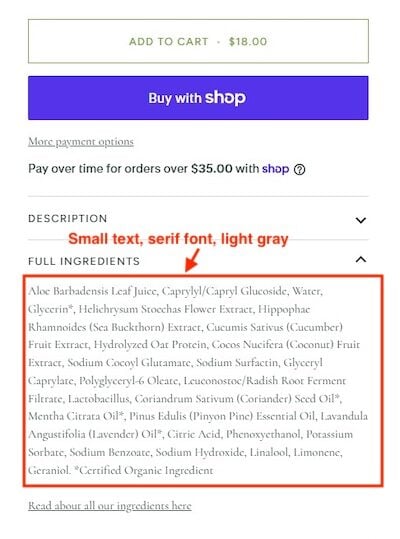
Handy for AI bots, not humans.
Beyond Safari
Social traffic typically arrives inside the Instagram, TikTok, or Facebook in-app browser, not Safari or Chrome. App environments aren’t just slimmer; they can affect what visitors see and what merchants measure.
In an in-app browser, a Chrome-optimized checkout can lose autofill, saved passwords, and payment credentials. Layouts, sticky elements, pop-ups, and scripts can also render differently or break altogether.
A finger, not a cursor
Finger-driven interaction on a phone is different from a desktop cursor.
Take product images. Mobile shoppers for a shirt want to see the fabric, the stitching, and the label up close. Disabled pinch-to-zoom or small fixed images create frustration, especially when competing stores have no such limitations.
That hesitation is easy to mistake for a pricing or trust problem when the real cause is a gallery built only for a mouse and a scroll. Ditto for embedded images of size charts and ingredient or care labels. They’re unreadable on a small screen without zooming.
While you’re checking, confirm whether shoppers can easily return to a page after pinching an image.