


Projects reach a successful completion by planning, but a plan alone isn’t enough to deliver on time and within budget. Costs, resources and performance must be tracked to ensure the actual effort aligns with the project plan. An S-curve is one tool that can help do that.
To understand why, let’s first define an S-curve graph in project management. Then we’ll explain why it’s used and how to make one. To save readers time, we’ll also link to a free downloadable S-curve template for Excel, followed by an example to show how it’s used in real-life projects.

Get your free
S Curve Template
Use this free S Curve Template for Excel to manage your projects better.
What Is an S-Curve?
An S-curve is a graphical representation of a project’s progress over time, typically used in project management to track costs, resources or work performance. The curve gets its name from its S-like shape, which reflects the natural lifecycle of a project—starting slow, accelerating in the middle and tapering off as the project nears completion.
S-curves are commonly used for performance analysis, forecasting and resource management. They help project managers compare actual progress against planned progress, identify deviations and make data-driven decisions to keep the project on track.
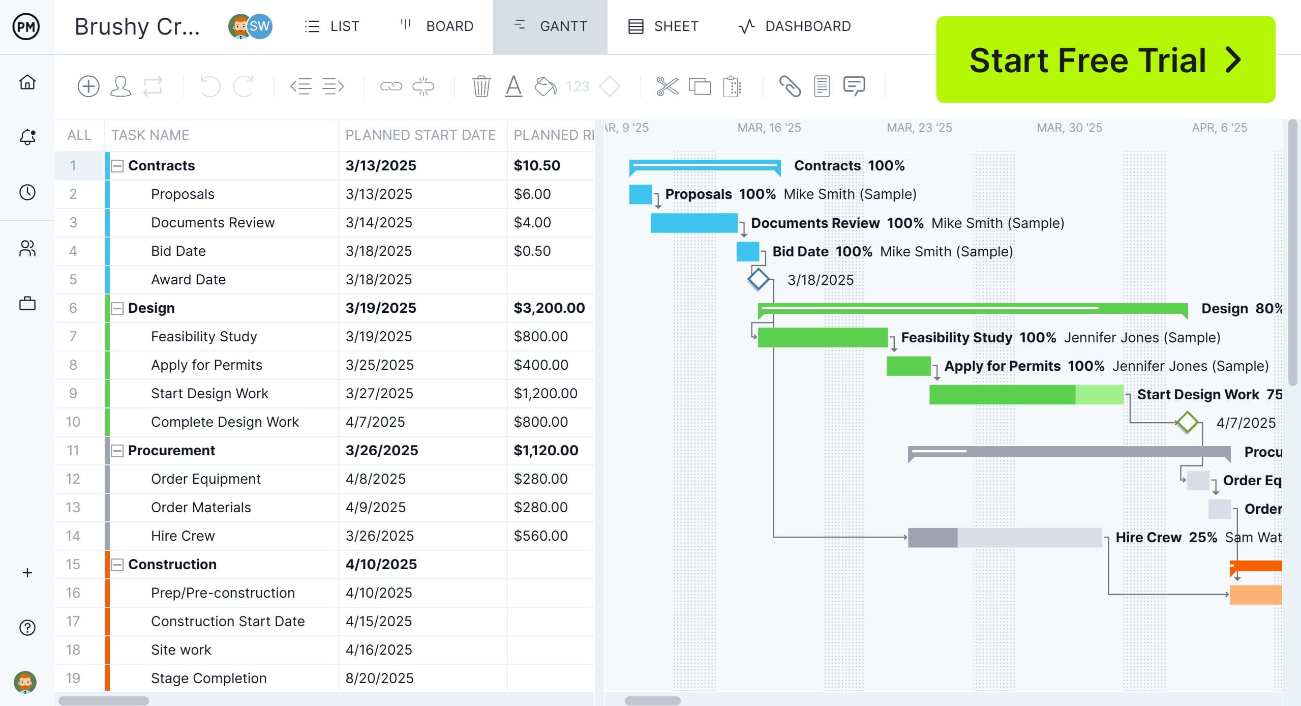
While an S-curve is useful for tracking progress, scheduling that work requires project management software. ProjectManager is award-winning project and portfolio management software with robust Gantt charts to schedule and forecast project tasks, resources and costs. To ensure the project progresses as planned, link all four types of task dependencies, filter for the critical path and set a baseline set to track the project in real time. Get started with ProjectManager today for free.
Why Use an S-Curve in Project Management?
An S-curve is a valuable tool in project management for monitoring and analyzing a project’s progress, resource allocation, costs and risks over time. By visually representing project performance, it helps teams make informed decisions, stay on schedule and ensure resources are used efficiently. Below are key reasons to use an S-curve in project management.
- Progress Tracking: The S-curve allows project managers to track progress over time by plotting actual work completed against the planned schedule. The horizontal (X-axis) of the graph represents time, while the vertical (Y-axis) represents key metrics such as cost, work hours or tasks completed. This helps teams identify delays or deviations from the original project plan.
- Resource Management: By analyzing an S-curve, project managers can assess whether resources—such as labor, materials and equipment—are being allocated efficiently. If the curve shows a steep incline, it may indicate a high demand for resources, helping teams anticipate and manage workload distribution more effectively.
- Cost Control: S-curves help track project expenditures over time, allowing managers to compare planned vs. actual costs. By monitoring cost trends, teams can detect budget overruns early and take corrective action before financial risks escalate. This ensures the project remains financially viable.
- Schedule Management: An S-curve graph provides insights into whether a project is on schedule, ahead or falling behind. If the actual progress curve lags behind the planned curve, it signals delays, prompting the need for schedule adjustments. This visibility helps teams stay aligned with deadlines and project milestones.
- Risk Management: By comparing planned and actual performance, S-curves help identify potential risks, such as unexpected slowdowns in work progress or resource shortages. Early detection of these risks enables project teams to implement mitigation strategies, reducing the likelihood of major disruptions.
How to Make an S-Curve Graph
An S-curve graph is a powerful tool in project management for tracking progress, costs or other key performance metrics over time. It visually represents the natural growth of a project, starting slow, accelerating in the middle and leveling off toward completion. Below are the key steps to create an S-curve graph.
1. Establish a Timeline for the S-Curve
The first step is to define the project timeline, which will be plotted on the horizontal (X-axis) of the graph. This timeline should cover the entire project duration, from initiation to completion, with specific milestones or phases marked along the way. A well-defined timeline ensures accurate tracking and analysis of project performance.
2. Determine What Project Area Will Be Measured
Next, decide what key metric the S-curve will track. It could measure progress (tasks completed), costs (budget spent), resource allocation or other performance indicators. This data will be represented on the vertical (Y-axis) of the graph. Choosing the right metric ensures the S-curve provides valuable insights for monitoring and decision-making.
3. Plot the S-Curve Graph
Once the timeline and key metric are defined, plot the S-curve by graphing actual project data against planned data. The curve typically starts with slow progress, then rises steeply as work accelerates, and finally flattens as the project nears completion. Comparing planned vs. actual curves helps identify trends, delays or budget overruns, allowing teams to adjust as needed.
S-Curve Graph Example
Let’s explore a real-life example to understand the practical application of using an s-curve. In the one we’ve sketched below, a construction company is building a bridge for vehicle traffic. Read how using an s-curve graph helps the construction firm keep track of its progress.
The infrastructure construction project commenced in January 2025, with an initial one percent actual progress, slightly ahead of the estimated 0 percent. The project steadily gained momentum throughout the early months, closely aligning with the projected timeline. By March 2025, actual progress was at seven percent, slightly trailing the estimated 8 percent, but recovered by April 2025, surpassing projections (12 percent actual vs. 10 percent estimated).
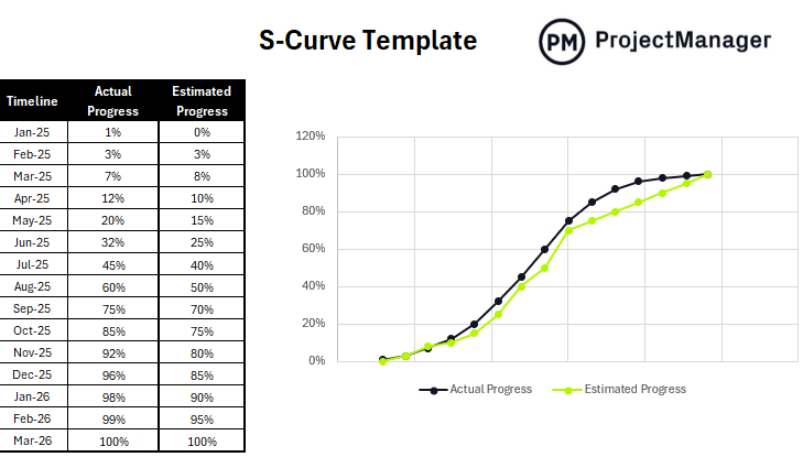
From May to August 2025, the project experienced a strong acceleration phase, with actual progress significantly exceeding estimates. By August 2025, 60 percent of the work was completed, compared to the forecasted 50 percent, indicating an efficient resource allocation and smooth execution.
By the end of September 2025, the project had reached 75 percent completion, maintaining a lead over the planned 70 percent. The trend continued into November and December, when the project exceeded estimates (96 percent actual vs. 85 percent estimated in December 2025).
As the project entered 2026, the final stages saw a controlled approach, ensuring quality checks and finishing tasks were properly executed. By March 2026, the project was successfully completed at 100 percent, precisely matching the estimated progress.
S-Curve Template for Excel
Pictured above is our free S-curve template for Excel to visualize project progress over time. Download this template to compare planned performance against the actual performance. The s-curve graph helps keep projects on track.
Our free template is a fully customizable document. We’ve formatted it with a chart on the left to capture the project timeline and actual and estimated progress. On the right is the c-curve graph, which automatically populates once the graph has been filled out.
Benefits of Using an S-Curve in Project Management
Project management professionals wouldn’t use an s-curve if there weren’t ample benefits to the tool. Here are a handful of those advantages.
- Helps compare actual project results against projections and estimates
- By plotting costs, risks, progress or other key project management areas, an s-curve graph helps identify project variances as they occur
- Can be used as a visual resource to document lessons learned
- Helps set realistic stakeholder expectations by showing the normal progression of projects, which in most cases isn’t depicted by a straight line
- Allows project management teams to decide when to reallocate resources to get projects back on track
Disadvantages of Using an S-Curve in Project Management
While S-curves help track project progress and performance, they also have limitations. Below are key disadvantages to consider when using an S-curve in project management.
- S-curves rely on historical data and may not accurately reflect sudden changes or disruptions in a project
- Analyzing S-curve trends can be challenging, especially for those unfamiliar with data visualization techniques
- The curve provides an overview of progress but does not break down specific task-level details or bottlenecks
- Any errors or inconsistencies in data collection can lead to misleading conclusions and poor decision-making
- S-curves work best for long-term projects with measurable trends, making them less useful for short, fast-paced initiatives
Related Project Management Templates
An s-curve template is only one of the over 100 free project management templates for Excel and Word that are available for immediate download on our site. They cover all aspects of managing a project across multiple industries. Here are just a few that can help monitor project metrics.
Project Dashboard Template
A project dashboard offers a high-level overview of project metrics. This free project dashboard template for Excel is set up to track tasks, workload, costs and more. The colorful graphs and charts help keep projects on track.
Budget Dashboard
There are also dashboards that are focused on specific metrics, such as cost. Download this free budget dashboard for Excel to view graphs and charts on total costs, planned vs. actual costs, direct material, direct labor, direct equipment and overhead costs.
Task Tracker Dashboard
Use this free task tracker dashboard for Excel to monitor, organize and track the progress of tasks or projects. It provides an overview of all tasks, their status, deadlines, priorities and other important project information.
Why ProjectManager Is Better Than an S-Curve for Managing Projects
An S-curve graph or any template is not what a project manager and their team want to plan, manage and track projects. These are static documents that have to be manually updated and are poor collaborative tools. Projects are dynamic and need project management software to provide everyone involved with the features they need to deliver the project successfully. ProjectManager is award-winning project and portfolio management software that has Gantt charts to schedule work, kanban boards and task lists to execute it and a calendar view to get a monthly overview of the project.
Manage Resources and Keep Teams Productive
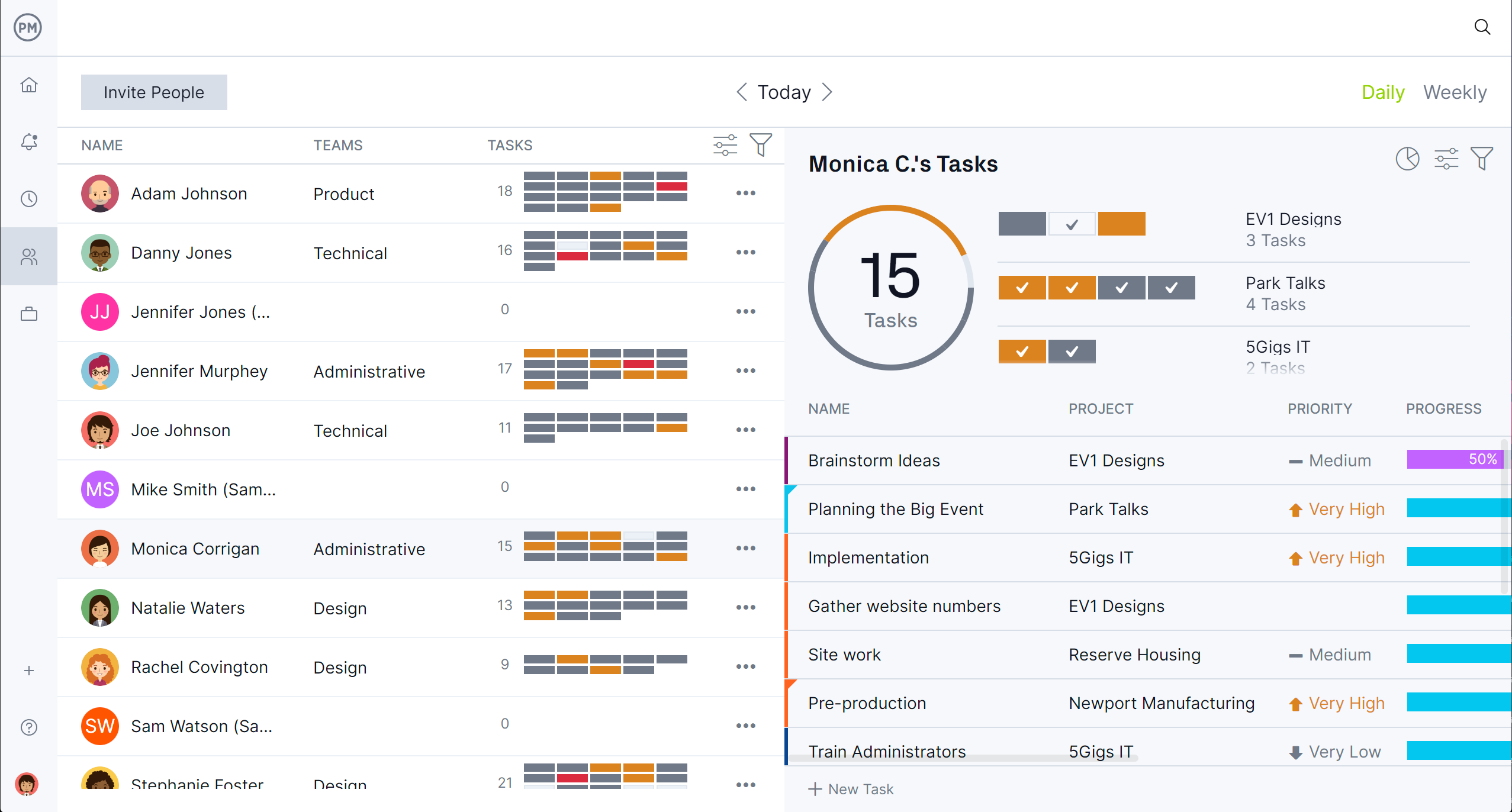
Resource management begins on the Gantt chart, where human and nonhuman resources are scheduled. When onboarding teams, project managers can set their availability, which makes it easier to assign tasks to the right person at the right time for the right job. Resource allocation across all projects can be viewed on the color-coded workload chart which makes it easy to see who’s overallocated or underutilized. The team’s workload can then be balanced without having to leave the chart. There’s even a team page that shows daily and weekly team activity, which can be filtered by progress, priority and more.
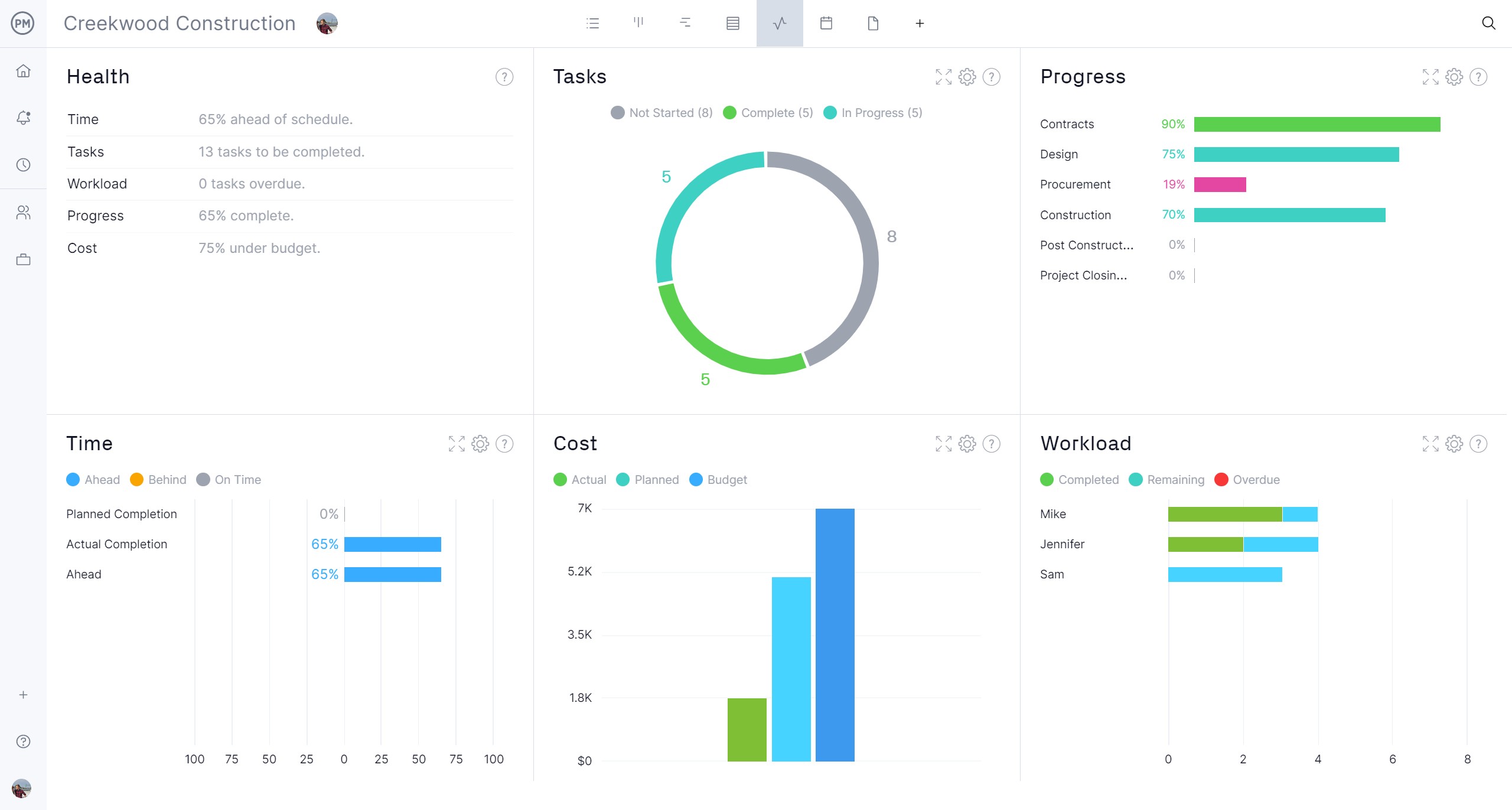
Monitor Project Metrics on Real-Time Dashboards and Reports
To get a high-level overview of the project’s metrics with a template, you’re going to have to add the data to see the graphs and charts. Our real-time project or portfolio dashboards automatically collect live data from one or multiple projects and display those metrics on time, cost, workload and more without having to set up the tool. Customizable reports go deeper into the details and can be filtered to show specific data points or a more general summary that can then be shared with stakeholders to keep them updated. Even our secure timesheets help by tracking labor costs to keep the project on budget.
Related Project Management Content
Using an S-curve to help manage projects is only a small slice of the larger project management pie. For those who want to read more, below are a handful of links to recently published articles that go into various aspects of managing a project.
ProjectManager is online project and portfolio management software that connects teams whether they’re in the office or out in the field. They can share files, comment at the task level and stay updated with email and in-app notifications. Join teams at Avis, Nestle and Siemens who use our software to deliver successful projects. Get started with ProjectManager today for free.


