Think about the logos you encounter every single day.
Apple. Nike. McDonald’s. Spotify. Jaguar.
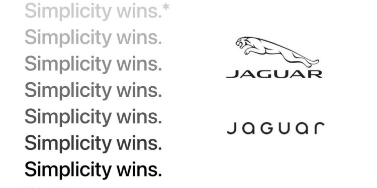
They’re so familiar, it’s almost as if they’re etched into our subconscious. But rewind twenty years, and logos were a whole lot different. Back then, they were crammed with details, ornate flourishes, and fancy embellishments — as if adding complexity made a brand more credible.
The first logo I remember drawing as a kid was McDonald’s golden arches. I couldn’t figure out why it stuck in my brain — but now I get it: simplicity works.
Today? Minimalism reigns. Clean lines. Flat designs.
It’s not because designers got lazy. Screens shrank to fit in our pockets. Our attention spans nosedived. Logos had to adapt. It’s like they went on a diet — losing all the fluff and carbs — just to fit into your pocket.
Simple logos aren’t just a design choice — they’re a survival strategy. (And trust me, I’ve had a few clients fight me on this one.)
I’ve worked with brands whose logos just didn’t make the cut. It’s a tough conversation to have, but it’s a necessary one. There’s an art in delivering the truth gently while guiding them…


