

Project management charts greatly help project managers plan, schedule and track progress on projects of all sizes. There are many types of project management charts and there’s one for each stage of the project life cycle such as project initiation or project closing charts, for example.
There are also planning charts, diagrams and matrices for each of the key 10 project management areas such as cost, schedule, resource or stakeholder management.
Luckily for project managers, there are many alternatives when it comes to choosing a project management chart to facilitate project planning efforts. In fact, using those charts is often a need for project managers. You’ll need to use a Gantt chart or a work breakdown structure to build your project plan, which is the foundation of your project.
What Are Project Management Charts?
Project management charts are visual representations of data that turn difficult project management concepts into easily digestible assets. They’re mostly used for project planning and take many shapes such as flowcharts, network diagrams or bar charts. Gantt charts, PERT charts, CPM diagrams and WBS diagrams are great examples.
Project management charts are especially useful when you’re communicating complex project planning information. They visualize data and turn complex concepts such as the project schedule or scope into digestible data for the project management team and stakeholders.
Data from project planning charts are even more useful when it’s tied to real-time project management software like ProjectManager. Our software takes a static chart and turns it into a dynamic tool for planning, execution and reporting. For example, our Gantt chart is ideal for showing a plan visually, scheduling tasks, resources and costs on a spreadsheet and a timeline. More than having the entire project on one page, project managers can link all four types of task dependencies to avoid delays and cost overruns. It’s easy to filter for the critical path and identify essential tasks. Plus, set a baseline to compare the planned effort against the actual effort in real time to keep the project on track. Get started with ProjectManager today for free.
Top 17 Project Management Charts
Before considering which project management chart is best for you, it’s important that you first decide which project management methodology you’ll use as there are differences between waterfall and agile project planning. It’s also important to note that you’ll need a variety of project management charts as each serves different project planning purposes such as creating a project timeline, allocating project resources, planning project work and more.
Below, we’ve selected the best project management charts for project planning so you can decide which are best for your project.
1. Gantt Charts
Experienced project managers are familiar with the Gantt chart. It’s a dynamic bar chart that shows the project schedule on a timeline. Although Gantt charts started out as a basic tool, they’ve matured and include enticing features such as task dependencies that note when one task is related to another.
Gantt charts are essential for modern project planning and scheduling because they allow project managers to visualize all of the activities that make up the project on a timeline. They’re also useful to monitor progress once the execution phase begins.
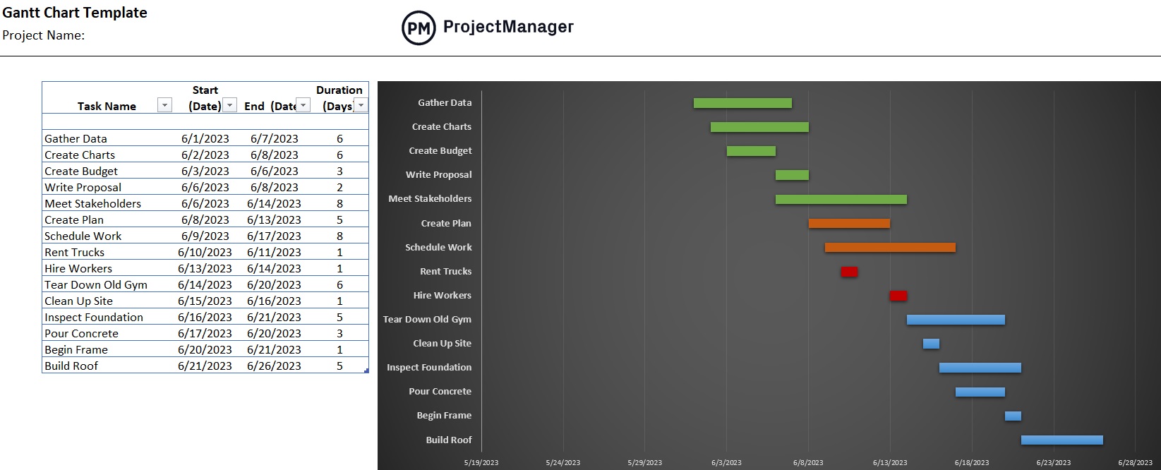
With new computing power, Gantt charts evolved from a basic bar chart to an essential project management tool that allows project managers to identify the critical path, assign tasks, establish task dependencies, generate a project timeline and much more. This is why most modern project planning software now includes Gantt charts.
One of the biggest advantages of using Gantt charts is that it also allows to create roadmaps to visualize the timelines of multiple projects in a program or project portfolio.
Online Gantt Charts for More Flexibility
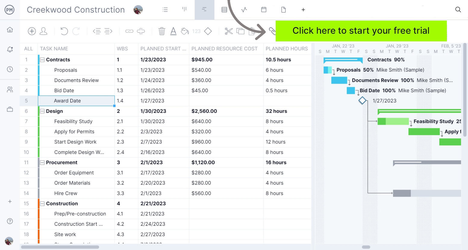
All Gantt charts aren’t equal; other project management software programs have Gantt charts, but they’re basic in functionality. ProjectManager offers Gantt chart features that the competition hasn’t yet considered.
To start, ProjectManager can import your task list and schedule from a static spreadsheet. If your plan was developed in Microsoft Project but you want to move that plan online to share with your team, know that ProjectManager facilitates the import of Microsoft Project files.
Once you have your project plan in ProjectManager, our online Gantt chart is a project management chart on steroids. You can link task dependencies to prevent team members from getting blocked. You can also assign tasks directly from the Gantt view which is an interactive project timeline that you can adjust in real time. Comment at the task level and all status updates are instantly reflected on the Gantt chart, which feeds into a real-time dashboard with project metrics that can be filtered and shared.
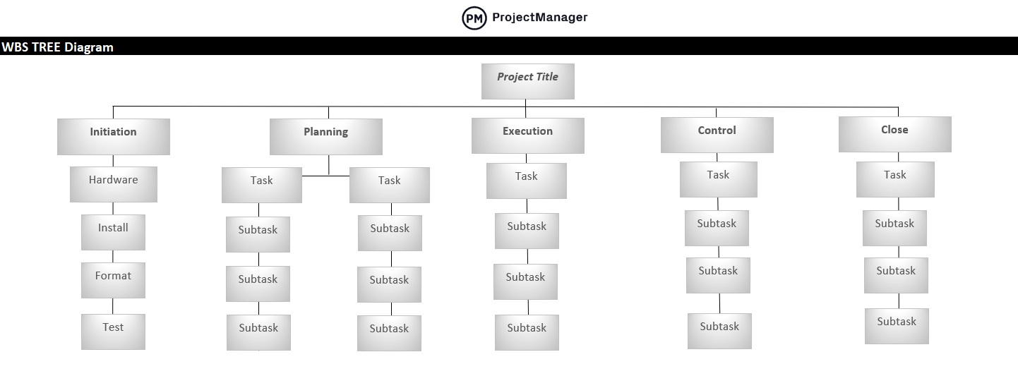
2. Work Breakdown Structure (WBS) Diagram
One aspect of project planning is organizing project activities, deliverables and timelines. That’s where a work breakdown structure (WBS) comes in handy. It’s a way to take the tasks a team must accomplish and split them into manageable sections.
The WBS is a deliverable-oriented hierarchical decomposition of the work to be executed by the project team. In other words, it’s a great way to visualize the tasks that need to be done in order to complete the project. It acts as a slightly higher-level view than a Gantt chart, which is useful for complex projects. A WBS can be represented as a list, a tree diagram, a spreadsheet or a column on a Gantt chart.
Once you have that information collected in our WBS diagram template, if you want a more dynamic tool that has more options, connect it to ProjectManager’s work breakdown structure software.
Upon moving the WBS diagram to ProjectManager, content is reflected over the different views in the software including the Gantt, task list and kanban board, a visual workflow tool. The online Gantt chart turns the WBS diagram into a powerhouse for project planning.
3. Flow Chart
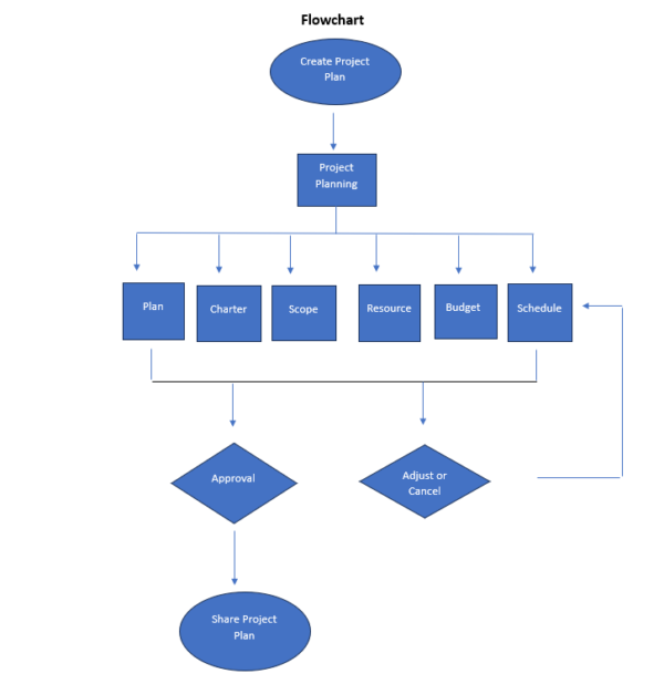
Flow charts are another tool project managers should have in their toolbox when project planning. These charts help visualize processes as a way to improve project efficiency. The flow chart is a graphic display of the project’s objective and helps create a logical order of the work required to reach that goal. Planning a project is all about control, and a flow chart gives a project manager a tool to exercise control over tasks, resources and time. This means all processes, including planning and monitoring, refer to the flow chart to increase efficiency.
This flowchart template has the basic symbols you need to represent a process.
- An oval means the start or finish of the process
- A rectangle represents an activity, or step in the process
- An arrow represents the direction from one step to another
- A diamond represents a decision
The example below shows the process of creating a project plan, and getting it approved.
4. Critical Path Diagram (CPM)
Another visual planning tool is the critical path diagram (based on the critical path method, or CPM). It’s used to show the activities that are required to complete the project. The diagram illustrates the duration of each activity and the preceding activity, how the two are related and lag (the amount of time between two activities).
A critical path diagram helps project managers break down a more extensive project into necessary activities in order to deliver a successful project. These activities are represented on the diagram as boxes. Between these activities or boxes are lines that represent the flow to show how each activity is connected and interconnected.
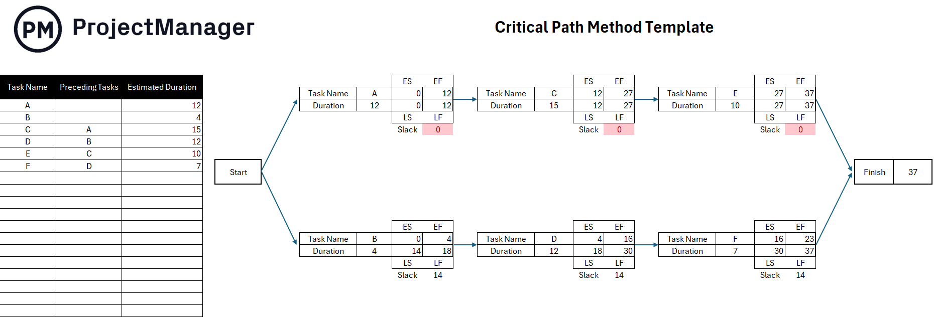
The purpose of using a critical path diagram is to allow project managers to calculate the total duration of a project. The critical path is made up of critical activities but non-critical activities are also shown. Non-critical activities allow for more flexibility as they don’t have a major impact on the project.
5. RACI Matrix
RACI is an acronym that stands for responsible, accountable, consulted and informed. A RACI matrix is a chart that helps assign responsibilities in project management. This table helps project managers identify stakeholders in their projects and gauge each level of involvement. This is done by noting next to each the initial R, A, C or I to categorize engagement.
For example, a responsible stakeholder means they’re directly responsible for the task. Accountable defines someone who delegates and reviews the work. Consulted means you’ll want this person’s input and feedback on the work being done, and informed are individuals who need to be updated on the progress of the work.
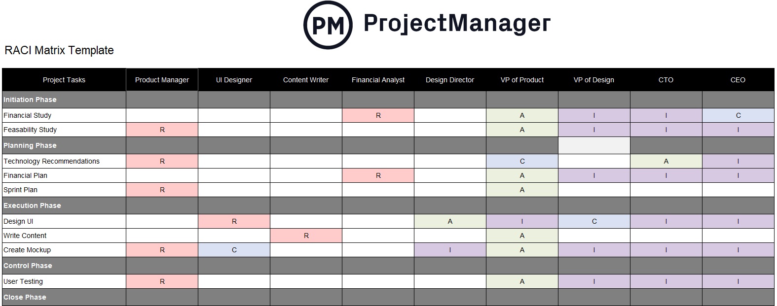
This is useful for assigning the responsibilities of team members on a project. But it can also be used to manage stakeholders. The RACI matrix helps a project manager to figure out which stakeholders need to know what and the frequency by which they should be updated on the progress of the project.
6. PERT Chart
This visual project management tool is great when you’re mapping out tasks and project timelines. PERT is another acronym that stands for project (or program) evaluation and review technique. It provides a graphical view of the project’s tasks, schedule and timelines.
A PERT chart is not a Gantt chart, though similar. Gantt charts are bar graphs while a PERT is freeform. PERT charts are made of nodes, boxes or circles that represent milestones. Connecting arrows show what must be completed between nodes and they represent the duration of each task.
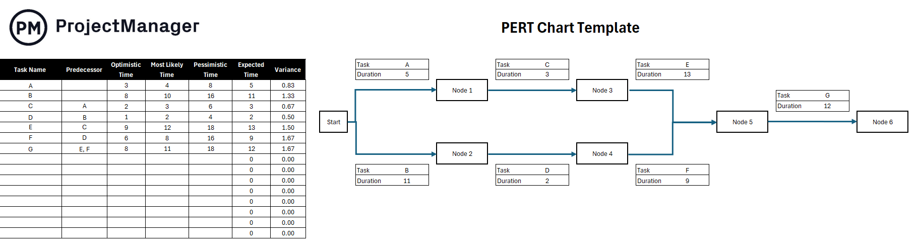
Some Gantt charts don’t show task dependencies, but all PERT charts do. They use directional, concurrent arrows to indicate a series of tasks that must be completed in a specific sequence. Diverging arrows indicate work that can be done in parallel.
7. Workflow Diagram
Workflow diagrams visually show the layout of a process, project or job. This is done as a flow chart. Workflow diagrams are commonly used to show the full business process and information flows, help employees understand their roles and responsibilities, expose redundancies and bottlenecks and avoid risks.
This project management chart can be made with software or drawn manually. Whichever route you take, you’ll get significant value from the workflow diagram. They help with operations and create greater efficiency by streamlining work. They also provide documentation for legal, compliance and audit requirements.
They’re a great tool for clear communication across the organization. Visual tools are often easier to digest no matter which department is looking at them. The workflow diagram is also a way to strengthen security. Workflow diagrams track information securely and make sure your organization is on top of any security gaps.
8. Risk Matrix
Risks can be good and bad, and project managers want to either take advantage of these unexpected opportunities or mitigate the impact of problems on the project. A risk matrix is used in project planning to identify and resolve risks as they arise as issues in a project.
The risk matrix lists risks that could occur based on experience and historical data. The matrix represents the likelihood of the risk appearing in the project and the impact it will have if it does show up. Risks are categorized based on probability and severity.
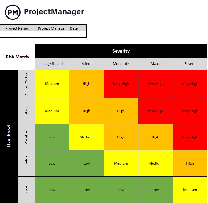
This tool helps project managers with their risk management on a project. It also communicates the risks that might become issues in the project to the project team and stakeholders. This allows teams to quickly capture these issues and resolve them.
9. Milestone Chart
The milestone chart is a visual timeline that helps project managers plan for significant events in their project schedule. Milestones are important events in a project, such as delivering the project plan or the end of one project phase and the beginning of the next one.
Each vertical line of the milestone chart shows one milestone. There’s a description of the milestone on the left-hand side of the milestone and a horizontal time scale that charts the entire project. The milestone chart helps keep your team, stakeholders and customers updated on major project events.
Making milestones in your schedule and tracking them throughout the project is one way to stay on schedule. Sharing the milestone chart communicates the major events in the project and ensures that everyone is aware of them. It’s like having advance notice for big deadlines that must be met. Because a milestone chart is a simplified version of a project schedule, they’re commonly used to report on the progress of multiple projects in a program or project portfolio to stakeholders such as executives who need a high-level view project status report.
10. Burndown Chart
In agile project management, a burndown chart is used to visually represent how quickly the project team is going through the customer’s user stories and it shows the description of the features being worked on. These descriptions are from the perspective of the end-user. The burndown chart shows the team’s effort against the full sprint.
The work that’s still to be done is shown on a vertical axis. The time passed from the beginning of the project is shown horizontally. This presents both the past and the future so everyone can see where they are. The burndown chart is updated regularly to make sure it’s accurate.
There are two types of burndown charts: one is used for sprints, or short iterations when their agile team works on user stories, while the other is a product burndown chart. The latter shows the work that remains for the entire project, while the former is only what’s left to accomplish.
11. Decision Matrix
A decision matrix is a project management chart that helps project managers evaluate different choices by assigning a numeric value to them based on a set of decision-making criteria.
Let’s imagine a construction project manager is using a decision matrix to decide what’s the best type of flooring for a residential project. He has three alternatives to choose from, hardwood, cement or carpet. To make the best decision, he should consider criteria, such as the quality, cost, value to the customer and safety that each of these options offer. Depending on how each alternative is scored, the decision matrix helps the construction project manager to logically determine which is the best choice.
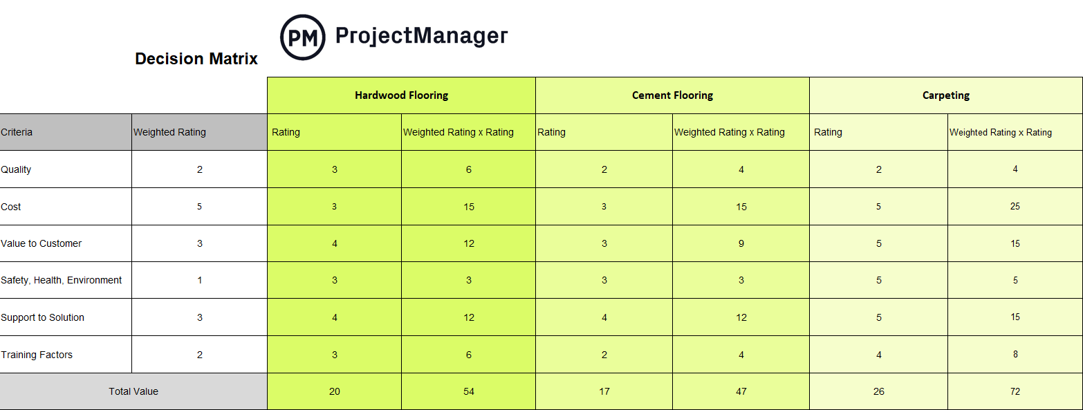
The image below shows how the decision matrix would look for this particular scenario. Download our free decision matrix template for Excel to create one for your projects.
12. Eisenhower Matrix
An Eisenhower matrix is a table with four quadrants that are used to prioritize projects or tasks by their level of importance and urgency. To understand how this project management chart works, it’s necessary to define what importance and urgency mean when creating one. In an Eisenhower matrix, importance refers to how impactful a task is for the success of a project, while its urgency defines how soon it should be completed.
By placing tasks in the four quadrants of the Eisenhower matrix, project managers can understand the relationship between these two variables. Depending on how important and urgent a task is, there are four possible courses of action, which are completing the task immediately, delaying its completion, delegating or eliminating it.
An Eisenhower matrix can also be used as a project prioritization tool by project management offices (PMO) that need to decide which projects or programs should be executed first.
13. Kanban Board
A kanban board is an essential project management chart that visually maps various phases that a task travels through. Tasks are represented by cards that are placed in the “to do” column and as progress is made, they move through various stages that the project manager defines. One main benefit of using a kanban board is that it allows for easy adjustments to priorities and workflows.
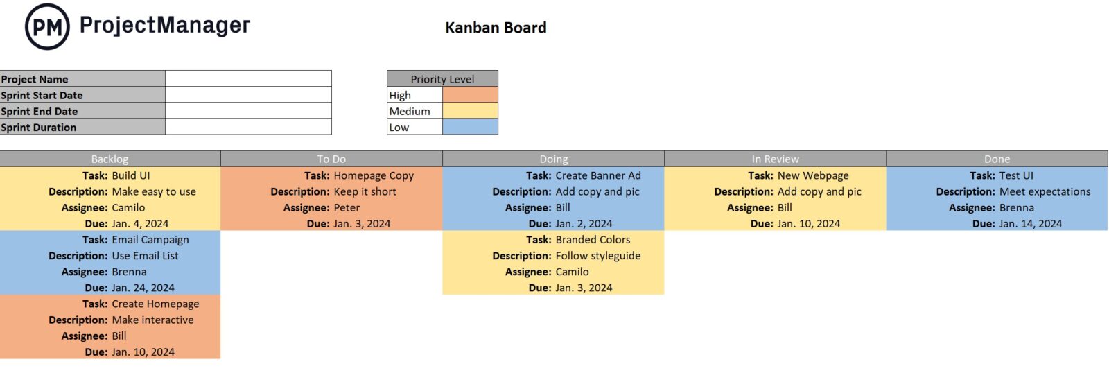
The goal of a kanban board is to maximize efficiency and limit work-in-progress. They offer a shared understanding of the project’s status to help facilitate communication and teamwork. They’re used in a variety of settings from software development to project management to personal task management. They’re a simple yet powerful tool to help boost productivity and achieve goals.
14. Decision Flowchart
A decision flowchart is an example of a project management diagram that helps map out a series of decisions and their potential outcomes. Think of it as a roadmap for the decision-making process as it offers insights through different paths based on the choices that are made. This flowchart includes key elements like start/end symbols, decision diamonds, process boxes and arrows.
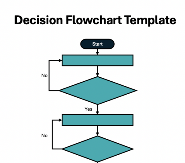
Some benefits of using a decision flowchart include that it clarifies complex decisions into smaller and more manageable steps, improves decision making and helps visually communicate the decision-making process to others.
15. SIPOC Diagram
SIPOC stands for suppliers, inputs, process, outputs and customers. Similar to other project management charts, this is a visual tool that helps document and understand a process, usually before starting on improvement efforts. The main goal of a SIPOC diagram is to offer a high-level overview of a process and its boundaries. It helps define the project scope, focus on the customer, identify improvement opportunities and gain a shared understanding of how the process works.

Ideally, SIPOC diagrams are used at the beginning of a process improvement process, typically when using methodologies like Six Sigma or lean project management.
16. Requirements Traceability Matrix
A requirements traceability matrix (RTM) helps map and trace project requirements throughout the project life cycle. It’s similar to a table that links requirements to different elements like test cases, design documents and risks. Typically, it includes requirements, design documents, risks and test cases. It acts like a roadmap that shows how each requirement is connected to everything else in the project.
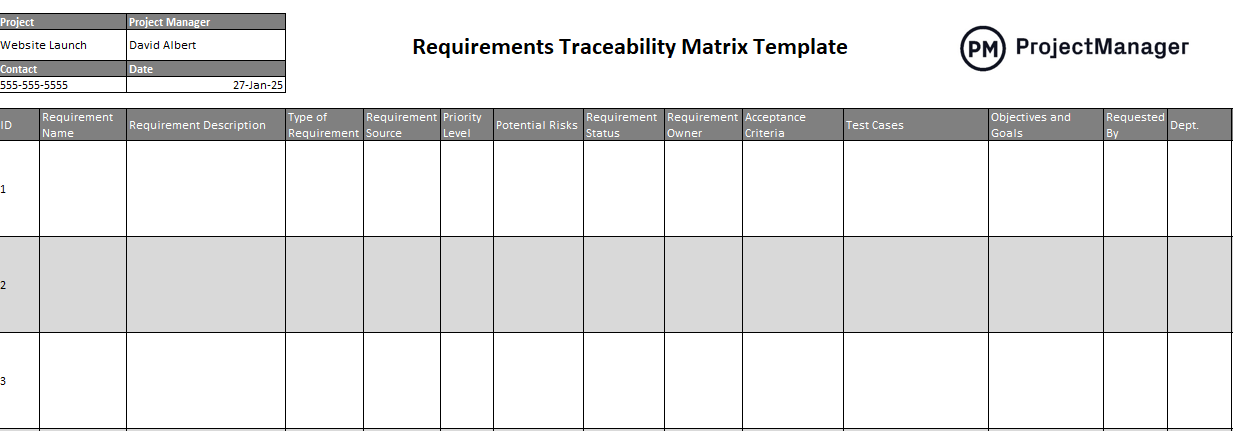
An RTM is important because it helps manage scope creep by linking requirements to other elements and ensures that all requirements are addressed in the project deliverables. It also helps testers understand what needs to be tested and ensures a shared understanding of requirements and their relationships.
17. RAID Log
RAID stands for risks, assumptions, issues and decisions. Like other project diagrams we have discussed, it acts as a central repository for information throughout the project life cycle, specifically focusing on risks, assumptions, issues and decisions. It’s created during the planning phase and updated regularly as the project progresses.
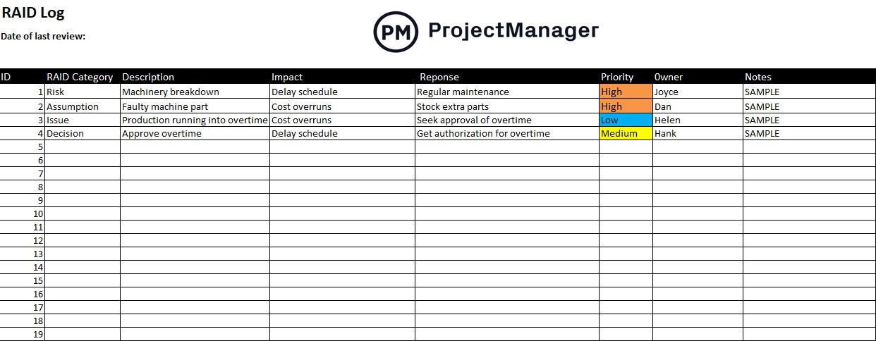
Primarily, RAID logs are used to help proactively manage risks by identifying and documenting them early. This allows teams to develop risk mitigation strategies and contingency plans. It also acts as a communication tool to keep stakeholders informed about potential risks, ongoing issues and key decisions.
ProjectManager vs. Project Management Charts
Project management charts are great visual aids and are helpful tools to set up the procedures for your project, but static documents can only do so much. When you start to plan and execute the project, you need project management software to connect teams and streamline work. ProjectManager is award-winnng project and portfolio project management software that automatically updates with real-time data to help you better manage your project. program or portfolio.
Manage Resources to Boost Productivity
ProjectManager’s online Gantt charts are great for scheduling work and sharing plans with teams. When onboarding those teams, set their availability, such as PTO, vacation, global holidays and skill sets, to assign the right person for the right job at the right time. Then get an overview of resource allocation on the color-coded workload chart, which makes it quick and simple to see who’s overallocated or underutilized. Then, right from the chart, balance the team’s workload and keep everyone working at capacity without risking burnout. There’s also a team page that shows a daily or weekly summary of each team member’s activities, which can be filtered by priority, progress and more.
Track Time and Costs With Real-Time Dashboards
With static documents, data has to be manually updated. Who has time for that? Our software does that busywork for you. Real-time dashboards automatically collect live data from the project, crunch the numbers and display the results in project charts. These six project metrics include time, cost, workload and more, all updated in real time to give you an overview of your project whenever you want it. There’s no setup involved, either. Want to get more detail than an overview of the project? Use our customizable reports, which can be filtered to see the data points you want or provide a general summary that can be shared with stakeholders. Even our secure timesheets, which streamline the payroll process, can help track labor costs to avoid breaking the budget.

Related Content
Check out our guides, blogs and templates where you can get in-depth information on more project planning charts and diagrams, so you can use them in all of your projects for better results.
Planning can make or break a project, so you want to have the best tools at your disposal when going through the process. ProjectManager is online project management software that helps you plan, execute, monitor and report on all of your projects. It works seamlessly with the project planning charts described above and has a robust set of project management tools to manage resources, time and cost. See how it can help you plan your project by taking this free 30-day trial today.


