

Hold a product in a physical store and learn what no label can describe: its texture, its flexibility, and how easy it is to use. Online, a shopper touches nothing, and few merchants try to address the tactile elements.
Yet some sites use photos to show what shoppers would otherwise need to touch.
Here are examples.
Let light do the touching
A simple way to replicate texture is to show light on an uneven surface. Color alone explains little. The right photo can catch grain or pitting only a hand would normally detect.
Backdrop, a paint brand, builds entire product pages around this concept. The color images are more than swatches. They are photos of an actual wall, with the pitting and roller marks.

Backdrop’s product images show paint on an actual wall, with pitting and roller marks.
Scroll down to see the wall half painted, half bare, mid-roller. It shows the paint as a material, not just a color.

A wall half painted, half bare, mid-roller emphasizes the material.
California-based Fireclay Tile deploys the same tactic. The product page photos include tight shots of a ceramic tile that catch light unevenly: glossy in some spots, matte in others. Other images show the tiles in an actual room.

Fireclay Tile deploys tight product shots that catch light unevenly.
Show it doing something
Light works on a surface. But for products such as bath bombs, soaps, and scrubs, what matters is what they do.
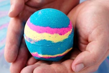
Lush Cosmetics Intergalactic bath bomb images show the product in water, replicating how it dissolves in a bathtub. They answer what the item does, not what it looks like in a box.

Lush Cosmetics bath bomb images show the product dissolving in water.
Lush carries this past the product page, onto the category grid. The thumbnail images of body scrubs show smears of each product so that shoppers can see its consistency.

The shower and bath body scrubs show smears of each product.
Next steps
• Use light to show a product’s physical texture. Put those photos first in a product-page gallery.
• Show your product transforming if it melts, dissolves, fizzes, foams, changes color, or crumbles.